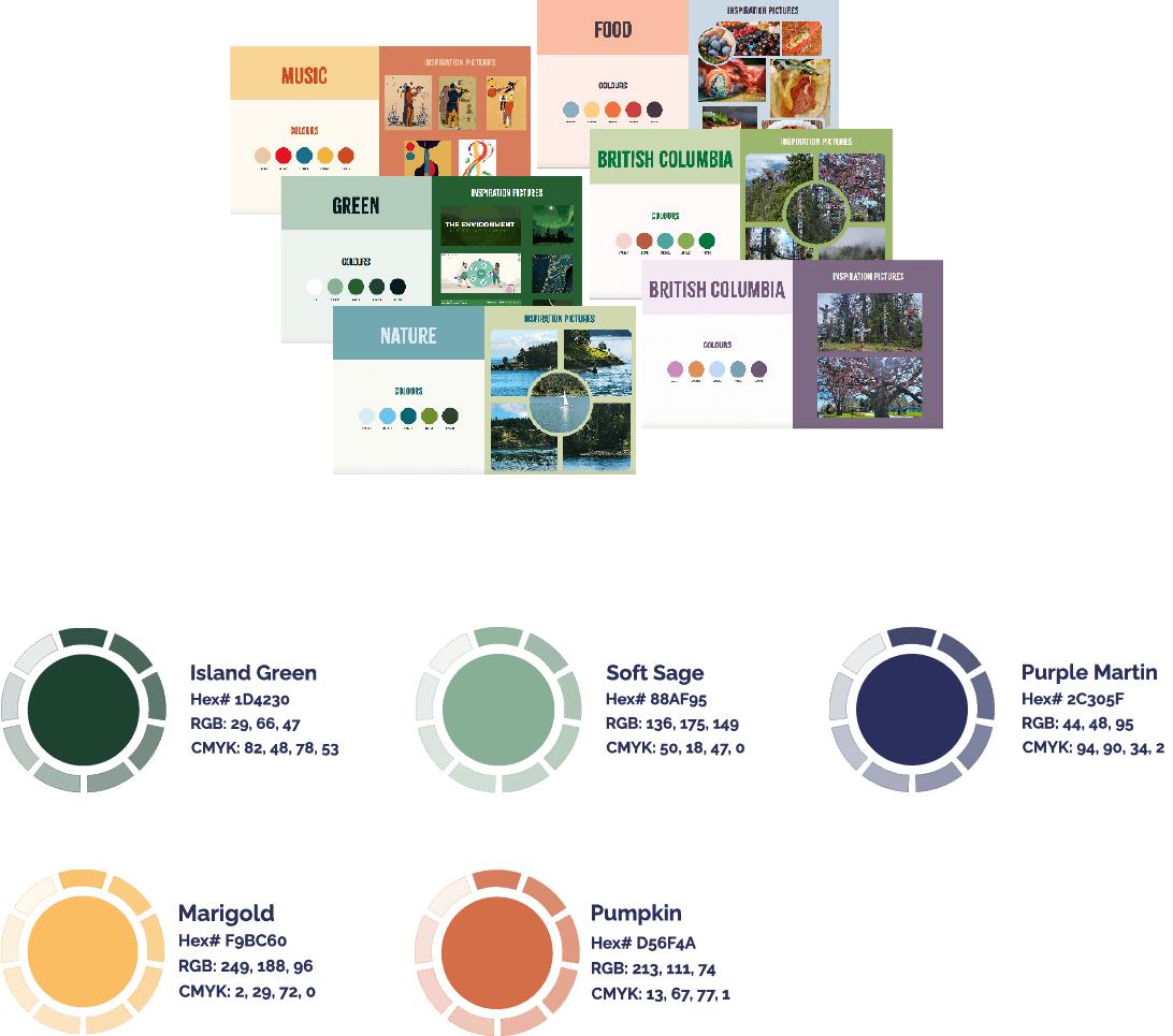
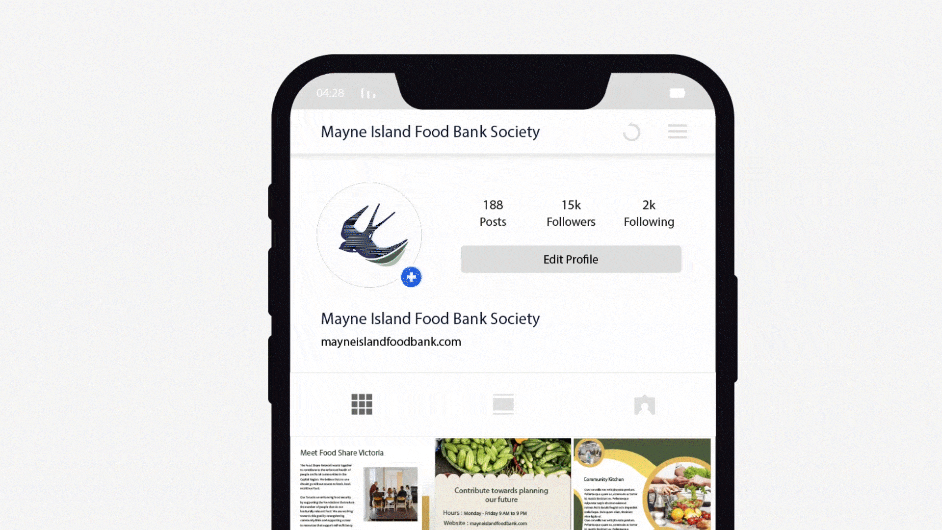
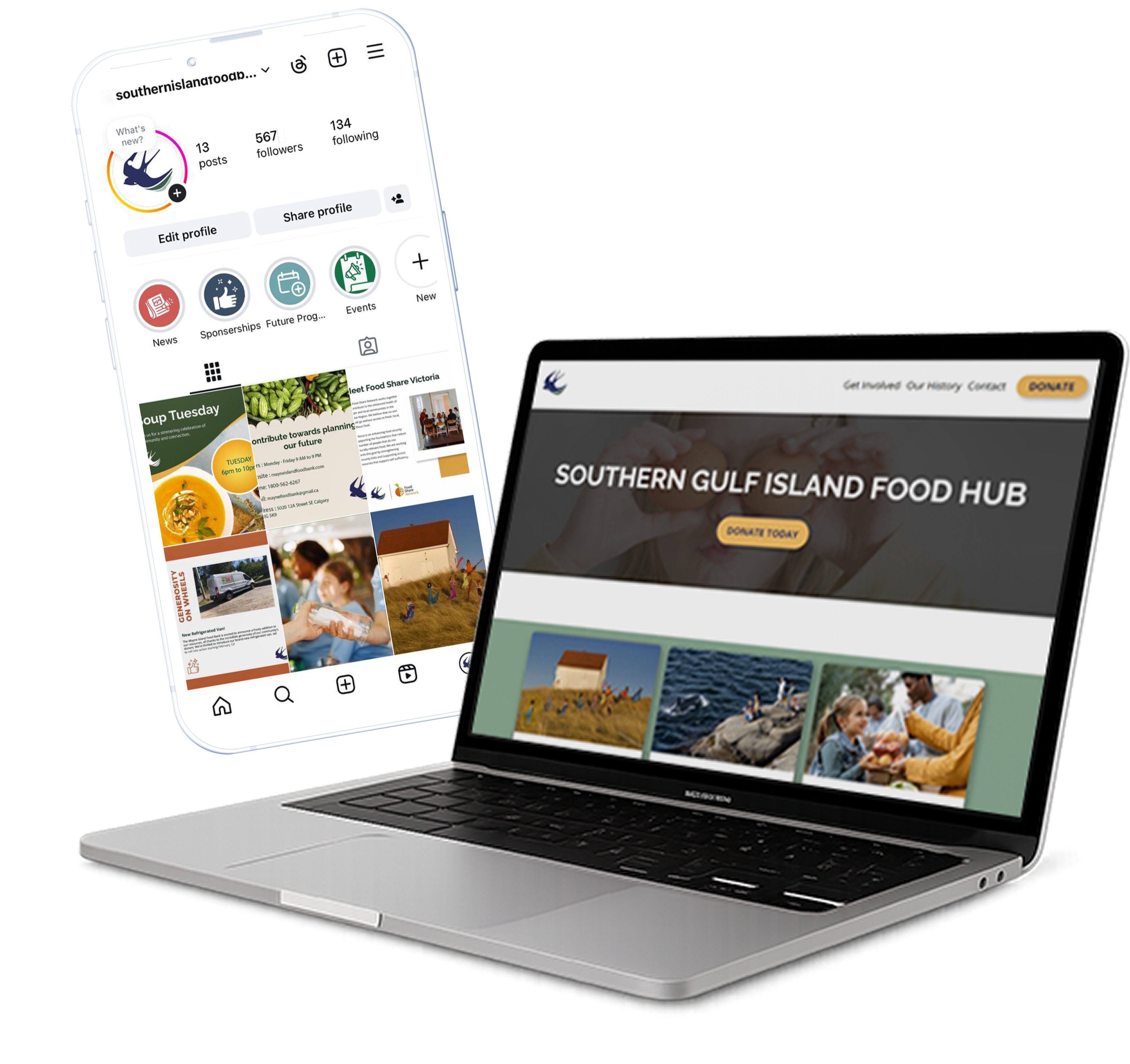
The Mayne Island Food Bank sought assistance to update its visual identity and website design. As the lead designer and project manager, I oversaw the redesign process, managed the design team, and communicated with the client at every step to ensure alignment with their values and community-driven mission. The goal was to develop a refreshed, inclusive brand that would better represent the food bankās evolving presence and make their services more accessible to those in need.
Project Manager
Adobe Illustrator, Figma, Adobe Aftereffect, Adobe Photoshop, HTML/CSS/JS
Group project ā research, ideation, design, and coding
The Mayne Island Food Bank had been serving its local community for years, but its visual identity and website no longer reflected its evolving mission or audience. The original branding felt outdated and lacked emotional warmth, while the website was difficult to navigate, especially for older users or volunteers unfamiliar with digital platforms.
Our team was brought in to solve several interconnected problems:
We needed to create a cohesive brand identity and user-friendly website that felt as compassionate and trustworthy as the food bank itself, while being easy for a small volunteer team to maintain over time.
I analyzed several small town and rural food bank websites across Canada, with a focus on:
Key findings:
I worked closely with the client and internal design team to identify core values and constraints:
"I just want to know when and where I can pick up food and I don't want to get lost in a confusing website."
"I want to support local causes, but only if they feel transparent, active, and real."
We maintained a balance of warmth and clarity to reflect the Food Bankās dual mission of support and reliability.
The rebranding effort significantly contributed to the development of Mayne Island's brand identity, imbuing it with a fresh, modern, and minimalist aesthetic.